” The public square could be a riotous free-for-all for those with businesses, events, or ideas to publicize …”
Ghosts of the Walldogs
What fading advertisements tell us about ourselves. From our Winter 2019 issue, “Rivals & Players.”
By Michael Griffith
*
These days, when advertisers talk about competing for eyeballs in “the public square,” that last phrase is generally figurative. But in the nineteenth century and on into the twentieth, at least until radio and its electronic descendants took the square indoors and eventually compressed it into people’s palms, the public square could be a riotous free-for-all for those with businesses, events, or ideas to publicize. Outdoor advertising dominated, especially for small enterprises — and in the first half of the twentieth century, in red-brick cities like Cincinnati, its most prominent mode was the giant sign painted straight onto the exterior walls of buildings by the artists known as walldogs.
Advertising was professionalized in the 1800s, with some of the impetus for that move coming from the lucrative bunkum surrounding patent medicines — which tended to be inert concoctions involving pungent herbs like fenugreek in a solution of 35 or 40 proof alcohol; they were held in especially high esteem in teetotaling households. (“When the going gets weird,” as Hunter S. Thompson would write in another context a century later, “the weird turn pro.”) But by the time the ad biz made its bid for respectability, the battle had already been waged by other means for centuries.
Advertising may have been beaten out for the status of oldest profession, but even in that field it has for centuries played a role. By the early Renaissance, many European cities codified special costumes for prostitutes: high-heeled slippers and a bell on one’s head in some Italian municipalities, striped hoods in London, and so on. These getups were intended, by churches and states that viewed whoredom as a necessary evil, in part to create a stigma and provide a warning to the unwary, but the collateral effect was often to help these women find their customers. (The same effect was achieved later by bedizenment with makeup, red lanterns left in windows, a flash of garter, and so on.)
There’s a useful analogy to be made here, I think: Like profession 1A, profession 1B has almost always been stigmatized, and the stigma almost always ignored — or used to advantage. In the end, moral disapprobation may turn out to be just another brand of empty ballyhoo that commerce uses to consummate itself. Disfavor can have its high ground, so long as traffic flows below.
If we think of advertising as simply the public competition for attention, it is of course ubiquitous, and ever more densely and dispiritingly so, it seems. One question that recent social media seem implicitly to pose, and then explicitly to answer and answer and answer, is this: In a hype-driven culture, who’s going to lug your banner if you don’t do it yourself? Right. Hence our world of humblebrag and Vaguebook, Egotweet and selfie stick — of near-constant advertisements for ourselves. But the phenomenon didn’t spontaneously generate itself in Mark Zuckerberg’s dorm room; putting oneself forward along with one’s art or ideas or moral convictions has as long a history as humans do. We are the products we sell. Our clothes are ads (regulated almost as efficiently as medieval sumptuary laws, which codified fur and fabrics by social station and, yes, controlled what prostitutes wore), our manners, even our names — and also the shingles or signs we hang out to trumpet them.
By this broader definition, one may consider the ninety-five theses Martin Luther tacked onto the cathedral door at Wittenberg in 1517 a kind of guerrilla advertising, an incursion into a public space “owned” by the Catholic Church to bring attention to a scrappy alternative.
But back to the literal public square. By the early nineteenth century, Western urban centers teemed with handbills and posters. This was perhaps most dizzyingly the case in London, where by the 1830s taxes and restrictions on newspaper advertising — together with merchants’ desire to tap a broader market than just the elite and the literate — created a pandemoniac playground for the rough-hewn men who posted flybills.
These freelancers, hired by merchants, battled for space on every available wall, pulling bills from their satchels and affixing them to any available surface with a paste-soaked roller, then coming back to repost them when, inevitably and often immediately, they were pulled down or blotted out. (Fisticuffs — or worse — were not unheard of.) By the 1830s, most available walls were thickly impastoed with bills, with layers accreting until the chaos became three-dimensional. Now the public square didn’t just teem; it bristled. (For a present-day analog, think of the staples one finds layered by the hundreds on telephone poles in commercial districts, looking like scale-model city skylines; you can read in their braille the history of the band gigs they’ve plugged, the lost cats sought, the stained sofas offered for sale.) In 1839, London’s Metropolitan Police Act outlawed posting bills on private property . . . but the ordinance defied enforcement: How to prosecute a single drop of water from a spigot turned full on?
For Londoners, these “billboards” constituted a useful nuisance. Authorities could rail about them, private property owners lament their profusion, but there was no stopping the practice. Part of this had to do with fear of commerce’s low, messy democracy, of the “mass” in the mass market. One may see that anxiety reflected in the British term for the walls on which bills were posted, “hoardings,” a term taken from medieval castle defense: a projection to keep out insurgents who might mass and try to climb the battlements. The word came to be applied, especially, to temporary barriers around construction sites or private property — the kind of blank, forbidding surface most alluring to flybill posters. (In the US, the term “wheatpaste posters,” derived from the kind of cheap, weak glue employed, was more common.)
In 1835, the painter John Orlando Parry produced the most famous image of flybill advertising, The Poster Man.

One thing to note in this remarkable image is how HIGH the upper echelons of posters reach. In a chaotic, seize-your-own-turf system like this, having the technology or the patience to post way up would help your message endure; meanwhile the lower tiers were papered over again and again.
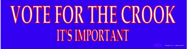
I remember a similar phenomenon in Louisiana when I lived there. In 1991, Holocaust denier and neo-Nazi David Duke made the runoff for governor by exploiting racist sentiment and the state’s unusual electoral system, which places all candidates into a so-called jungle primary, then moves the top two vote-getters forward. Worse, once Duke made the runoff it seemed that he might win. His opponent was the flamboyantly corrupt ex-governor Edwin Edwards, a man who in a previous “comeback” campaign, asked by reporters what it would take to squander his late lead, answered, “I’d have to be caught in bed with a dead girl or a live boy.” The bumper sticker one saw all over a panicked Baton Rouge that fall was Vote for the Crook: It’s Important.
Edwards would go on to win, before finally encountering a charge he couldn’t wriggle free from and spending nine years in prison, then — giving new meaning to the term “supervised release” — several more in the purgatory of reality TV, where he played the role of the doddering possessive in The Governor’s Wife.
My most vivid memory from that campaign, though, was the fact that David Duke’s signs — instantly ripped down when they appeared in accessible locations — migrated higher and higher up poles and buildings and trees. Liberals, his people correctly calculated, didn’t have access to cherry-pickers or heavy equipment. For fully a decade afterward, driving through the bayous of south Louisiana, you could often spot a faded Duke sign twenty feet up a pole, curled next to an old glass-bell insulator.
Bumper stickers, of course, are also ads.
*
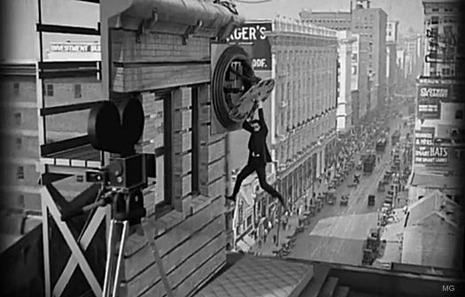
In their 1972 book Learning from Las Vegas, the architects Denise Scott Brown, Robert Venturi, and Steven Izenour argued, among other things, that Las Vegas was the first cityscape designed to be encountered from a car window and at cruising speed — thus the huge, glitzy signage, the unwalkable chasms between casinos on the Strip, the vast and sun-baked parking lots, etcetera.
Some of their claims are still much debated, but what’s stuck with me and seems incontestable is the basic underlying assertion: Las Vegas, history-less, sorceled as if out of the thin desert air in the late 1940s, was in its DNA a new KIND of city, the postmodern city, and its scale and sight-lines and neon glare represented a departure from what had come before.[i]
The transformation of American cities between, say, 1880 and 1929, driven by rapid technological advance, was similarly dramatic. And one marker of that change — the one that’s our subject today — was the bold, enticing Carnival of Signs that cities became. Early-twentieth-century American metropolises can be seen as the slower-speed, pre-neon precursors of the Las Vegas that Brown, Venturi, and Izenour would write about . . . and equally well as the larger-scale, more vertical progeny of the visually chaotic London depicted by Parry.
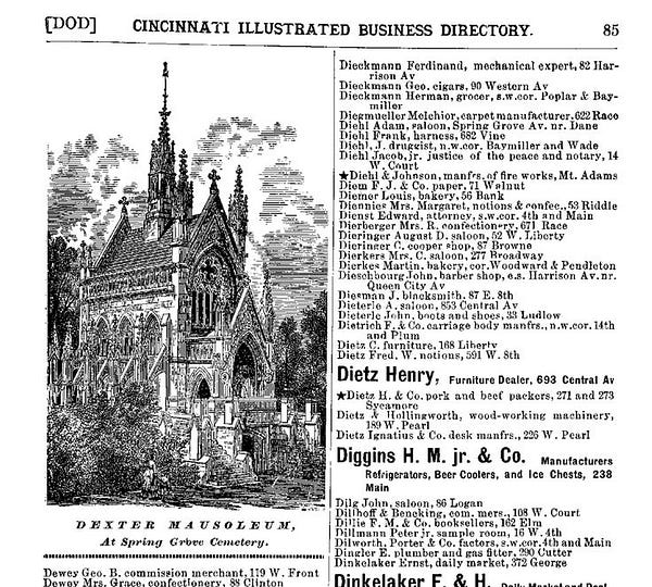
In Cincinnati, by 1890, a few telephone numbers had trickled into the annual Illustrated Business Directory. Businesses could purchase a star next to their name; bigger or deeper-pocketed enterprises might spring for boldface type or even, in a few instances, a display ad. But mostly the directory was just an unadorned list, with an enterprise’s address serving as the primary attractant (“Hey, this one’s just around the corner!”).
Advertising beyond one’s immediate environs was difficult and expensive . . . and what would be the purpose, in a city with only rudimentary transportation options? (The city’s first streetcar system began operations just about the time that 1890 guide would have gone to press.)
In the age of the automobile, sign painters flourished. Cincinnati’s 1893 illustrated directory, for example, has 165 listed under the housepainter/sign painter category and another 20 commercial sign painters. (Of those 185 total, only a dozen listed phone numbers.) In the hyperlocal city organized around small, discrete neighborhoods, signs played a critical advertising role and, perhaps even more significantly, a unifying role, directing people hither and yon.
Signs had to indicate what kinds of business were being transacted inside a building, where to enter, which stairwell to climb or elevator button to push, whom to ask for, etc. Many signs were small and basic: first initial, last name, and profession, painted on glass or suspended from a lintel. But others made use of gilt, dramatic shading, extra colors; some businesses and tradespeople started including additional information about the services they performed, even a slogan or bit of hype or flashy trademark; still others opted for signs that either dwarfed or blocked others into irrelevance.
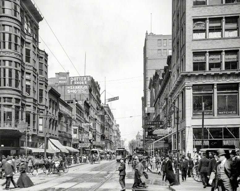
These sign advertisements grew ever brighter, splashier, and more elaborate, especially where there was intense local competition, and eventually some downtown blocks became forebears — all in paint — of the Glitter Gulches to come.
But the scale was about to go colossal, with signs that took up entire sides of buildings — sometimes with windows subsumed into the design, so that a person working inside might become a dot in the pattern, a cog in the wheel (or mote in the eye) of advertising.
*
When ads got bigger than people, something changed.
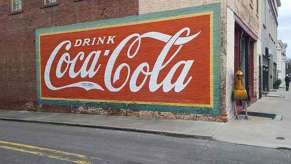
After the turn of the century, as telephones grew near-universal, streetcar suburbs developed, and automobiles became more prevalent, local businesses saw opportunities to broaden their customer base, and emerging national brands seized the initiative, too. By 1910, Coca-Cola was devoting 25% of its ad budget to signs painted on buildings, whether on brick in city centers or on wood-frame in small towns; they and other companies (for instance, Mail Pouch Tobacco) adapted the strategy for rural landscapes, too, offering farmers near new thruways cash in exchange for the right to paint their barn roofs. In Cincinnati, many businesses used their own buildings as canvases for display ads . . . or raised cash by serving as billboard for someone else.
The term walldogs originated, it’s thought, from the fact that while doing the brushwork, the men who painted such signs usually had to dangle from harnesses, and they looked like dogs straining at their chains. The job required skill and finesse, physical toughness, design and planning ability, plus a command of math for proportions, of color theory for contrast, of chemistry for paint-mixing. Many of the big advertisements painted in small towns were done by itinerant walldogs who moved with the work and the weather. But cities like Cincinnati had enough work to support an indigenous industry.
A certain romance may attach, from our distance, to this labor: Walldogs had the chance to gaze upon the dynamic, growing city from a perspective not afforded many. I’m always amazed, in urban photos from the early twentieth century, by how few of the trappings of today’s compulsive privacy had yet occluded the view: Look at the salaryman gazing out from the third floor, his feet on the sill, as he peels an apple for lunch in a stripe of sun; halfway up the hillside beyond him a woman, pinning undergarments to a line, has paused to wave to a friend on the funicular that glides slowly past just thirty feet away. The early-twentieth-century city always seems to be in dishabille, and wariness of the camera hasn’t yet blunted or averted people’s gazes. And walldogs were on especially intimate terms with their environs.
Once, in an interview, John Updike was asked what animal he would like to be, and he chose the turtle; he’d always loved the sound of rain on the roof, he said, and he figured turtles must get a lot of that. I envy walldogs in a similarly fanciful way, for the point of view from which they could engage the city, for the benign voyeurism that was available to them.
But just as Updike understands the falseness in his choice, the sentimentality, I don’t really want to have been a walldog; the work was dangerous and hard. Beyond the physical peril, exposure to harsh weather, and the enveloping haze of smog and stink, there was the paint itself. The painters had to concoct their own, using linseed oil, pigments, volatile driers like gasoline . . . and white lead, in such copious amounts that they had to dip it out of buckets. Some walldogs counted bricks and then (astonishingly) free-handed it; others meticulously mapped their canvas in advance. The work, on rough surfaces often with impeding structural elements, could be tedious and technical — and the result had to look seamless, bold, unfussy.
Today, almost all of us have seen walldogs’ work, in the form of so-called ghost signs still faintly visible, often alongside — but, you’ll notice if you look, rarely marred by — the sprayed graffiti that reads as an homage to it, on buildings that haven’t fallen prey to urban renewal. Rust Belt cities and down-at-the-heels towns, places that emptied out rather than being redeveloped, tend to be rich in such ghost signs. Cincinnati is a bonanza for the aficionado.
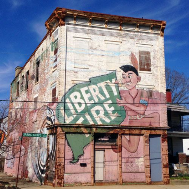
The relatively recent ghost sign above was located in my neighborhood and was until recently visible (distantly) from several nearby highways and ramps. It was unusual in being from its origin a concession to and acknowledgment of blight. It was painted after the building’s abandonment (note that the letters on the blanket run directly over windows), and with the clear presumption — accurate, alas — that it wouldn’t again be occupied anytime soon. The tire business, too, is now defunct, and the signage is gone.
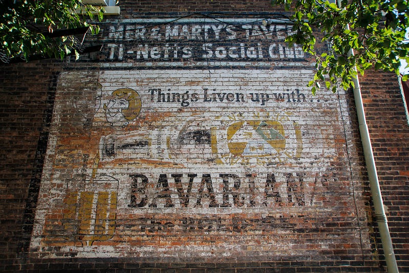
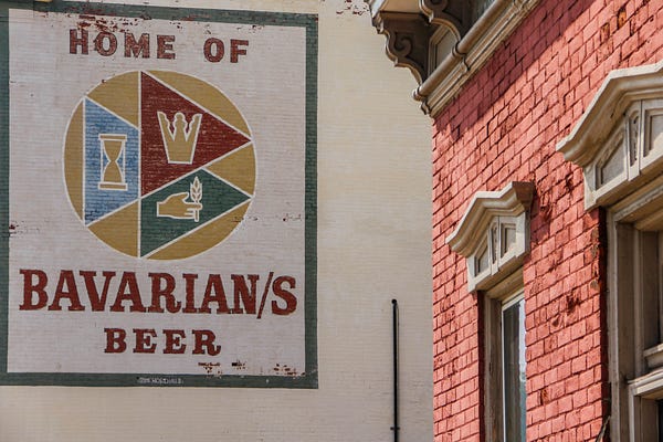
This one — painted on the side of a bygone bar — is for a local beer that died out in the mid-1960s.
Ghost signs have endured because of their poison. The clinging paint owes its tenacity to lead, which — this is why it’s so hazardous — tends to bind hard, sink deep, and not leach away. Old-time walldogs often used non-leaded or lightly leaded paints for contrast, which is why on many fading signs it’s the letters themselves, and not the backdrops against which they were set, that have hung on.
*
The walldogs’ fading but stubbornly visible art appeals to me for another, more personal reason — which can only be explained by way (apologies in advance) of a circuitous confession. When I finished college in 1987, I planned to spend a couple years in Germany, studying literature and “mastering” the language, the related goals I’d been working toward for four years. But during my senior year, it suddenly — I can explain the suddenness only as a character flaw — occurred to me that I was deluding myself.
I’d started language study late, discovered I had a knack for it, and the curve of my progress was steep enough that I fooled myself into believing that mastery was a milestone to pass rather than an asymptote to fall short of. I should have realized this when, after my sophomore year, I spent the summer working in a German bank, fetching foreign cash from the vault-keeper, counting and recounting it in a machine, wrapping it in banderoles, and then using a red signet and wax to seal it into canvas bags we’d dispatch to branches to be handed out to vacationers heading abroad.
On the one hand, my coworkers flattered me by complimenting my carefully constructed sentences, often thirty or forty words long, with the verb suspended — as required, in written Hochdeutsch — until the very end. On the other hand, I could barely follow their short, sharp, colloquial German (or in the vault-keeper’s case, the unintelligible dialect called Platt), and my ability to ferret out, say, phallogocentrism in Kafka did me no favors in the streets or the shops (“I am merely grazing,” I told the bookstore clerk, proud to know a word for “browsing” but not quite understanding what the word literally meant in my own language).
I arrived back in the U.S. that summer with a voluminous version of British-invasion shag haircut, not as a statement — no one would have made this particular statement on purpose — but because I had both no idea how to negotiate a German barber shop and an aversion to looking or feeling stupid as I flailed for the words that might, or might not, mean “bangs” or “part.” Every time I jogged in my final fortnight in Germany, the tips of my hair slapped me stingingly in the eyeball, a rebuke I ignored. By spring of my senior year, though, the flattening learning curve had grown more apparent — how would I ever catch up to native speakers, or to those baptized in the language by childhood dunking rather than having it sprinkled over their foreheads in late adolescence? — and I decided to step back and try something else.
That August I moved to New York, squatting for a few weeks in a friend’s apartment while hunting a job. Then I got lucky, landing a made-up position at what was then the only woman-owned and woman-run ad agency in New York. My bosses were four partners in their early forties, all longtime veterans of Madison Avenue. They’d entered the profession during the sexist heyday of the Man in the Grey Flannel Suit (or of Mad Men’s Don Draper), and in 1986 they decided to go out on their own. They’d been in business less than a year when I came on.
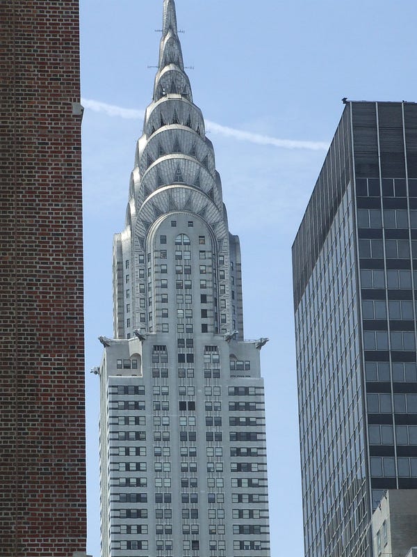
They were wonderful to work for and with, and the setting was dazzling: Our 45th-floor office in the Chrysler Building faced south, and some evenings, as dusk gave way to city-sparkle, one of the partners would play the grand piano they’d installed while the other eight or so of us sprawled on couches and drank the liqueur that was an early client, Pecher Mignon. (I initially imagined that the name meant “Peach Steak,” but I had sense enough not to say so.)
My job was to be an apprentice jack-of-all-trades. I enjoyed my witty colleagues, especially my office-mate, a soap-opera actor, playwright, and gardening writer. I enjoyed the sheer weirdness of the job — hunkering for a whole morning in a conference room to sniff matchsticks of perfume-soaked paper as we searched for the scent to correspond to our concept for a cologne to be called “Cooler”; dining in Grand Central’s oyster bar with a gossip magazine media buyer who was at first annoyed to be passed off to the powerless newbie, but who after a glass of wine and some chat about rustic breakfast specialties, our unlikely point of overlap, relaxed and seemed to enjoy the meal his company was paying for; sitting in a darkened room watching reel after reel of music videos by directors seeking the agency’s first TV commercial, a spot for Agree shampoo set to star ex-GoGos vocalist Belinda Carlisle. (We were gaga over the samples from a guy then in his mid-twenties, David Fincher, and I watched over and over his haunting video of Sting singing a medieval Basque carol called “Gabriel’s Message.” In the end, I think he was the director chosen.)
I enjoyed, too, the forty-minute walking commute every morning, time I spent trying to chart a course between clichés, Slack-Jawed Rustic Turning Awed Circles at the Center of the Universe and Dead-Eyed Cynic Trundling Along at High Speed. Long-time urbanites, I’d noticed, seemed to have developed a version of sidewalk echolocation, and could steer harmlessly away from all need or contact without ever noticing it. I tried halfheartedly to duplicate the skill, but I sucked at it. I was avid for seeing and simultaneously afraid to look: Every person I encountered might be Medusa. So I did all my observing through hooded reflections, cheating sidelong glances, and three-rail bank shots: rearview mirror to display window to . . . wait, did that guy really have tighty whities on his head, with pigtails poking through the leg holes and the Y-front at his forehead like a Cyclopean eye? The tone of these walks toggled between world-weariness and exuberance, resignation to the world’s uglinesses and the young person’s sense that things not only should be better but might be, any minute now. (It was a Kurt Vonnegut tone, and it happens that as I meandered south through Turtle Bay I’d often come up behind the writer himself, looking headless as he carried a child on his shoulders.)
My job occasionally allowed me to try my hand at writing. One client, House Beautiful magazine, wanted us to put together a city-bus campaign that would persuade media buyers that its readers were not dowdy old-timers but smart, dynamic — and, not incidentally, wealthy — women. The idea was to take clichés and set phrases and tweak them in a way that might read as unthreatening Feminism Lite. My office-mate came up with “She’s Heels on Wheels” for the ad that would focus on matters automotive, and his tagline for the objets d’art ad was “She’s looking for prints charming.” We had trouble coming up with a suitable phrase for an ad about high-end bathroom products: claw-foot tubs, faucets, marble, linens, lighting. I made a throwaway joke about “She Skips to Her Loo,” we jotted it down, and to my shock, the client chose it.
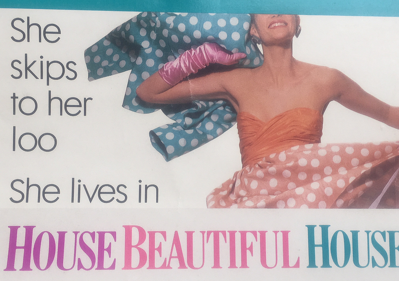
For a couple of months that winter, I would occasionally see a bus flash by with my idiotic slogan on it, and I would cringe in shame. Or so I thought; I would have testified under oath that my emotion was 99-44/100% pure humiliation, and the .56% that wasn’t ought to have been. Only later would it occur to me that there was pride even in the shame. Who would know or care that this ad — designed to get advertisers to flog their products in a magazine, and for the majority of Manhattanites and visitors just another irrelevant and invisible squiggle in the city’s seething visual backdrop — had anything at all to do with me?
The slogan was stupid, yes. It was throwaway. But it was mine. And though I would never have acknowledged this at the time, I was laboring under another of the clichés of bumpkinhood, the ambition to make my mark. My response to those winter-grimy buses rumbling past seems now, after thirty years, wrong in multiple directions. On the one hand too harsh, because here — in whatever degraded, silly form, and detectable perhaps only to me — was a mark, and I might have felt lucky to make it. On the other hand too kind, because there is far more arrogance than I thought then in believing there’s a hierarchy of marks, and to imagine that you can enforce your ranking, or decide what thing you do in your life will count, is not only arrogant but delusional. Only in a cemetery can we choose our memorials — and even there we can’t choose what living memories will attach to them.
*
Which leads us, at length, back to Cincinnati and its walldogs. Or — well — almost.
I am a sucker for selflessness, real or fictive. I cry over books, kids’ movies, newspaper articles, radio stories, pop songs (there’s one, not to be named here, that has made me sob, alone in my car, at least fifty times in a row, its effect magically never diminishing). Fearing what I’ll find, I’ve tried not to poke too deeply into the psychology behind this, but certainly my attraction to self-sacrifice has to do with knowing that in my case the only (limited) way it can happen, when it’s called for, will be by conscious, long-cultivated moral decision. Like most of us, I have a troubled relationship with ego, which seems simultaneously the necessary precondition of and spur to doing the things that matter most to me . . . and a monster to be indulged only guiltily and fleetingly, and otherwise balked, throttled, suppressed.
One corollary to this has been a deep admiration for professions in which one exerts serious skill invisibly, in service of someone else who will get the credit, if credit there be. I remember reading, twenty-five years ago, Marjorie Sandor’s “The World Is Full of Virtuosos,” about a gifted pianist who chooses to become an accompanist. The story had the power of a revelation to me, not because the accompanist’s art was selfless (he took immense but private pride in it, as I recall) but because he’d found a way to square the circle: to expend his ego in the service of something and someone else, but still to derive secret satisfaction from it.
I feel a similar draw to editors, translators, defensive stoppers in basketball, vernacular architects, the designers of ordinary objects (zipper, grapefruit knife, lint trap, crisper drawer). The effect is heightened if the job pays poorly, as it often does (teacher, nurse), or if it involves creating what we might call surplus beauty, an artistry that might not be noticed or credited and that need not be there for the thing to work (furniture makers, metalsmiths, potters). This is, of course, nothing remotely like an exhaustive list . . . and almost any task, embraced in the right spirit, might qualify.
Even advertising. One thing that fascinated me, in my brief time in the field, was the apparent cleavage between the client’s aim and the agency’s. Often that tension gets oversimplified or burlesqued: The client wants sales, the creatives want flash, and the account executive negotiates between these incompatible values, the bottom-line stiffs on the one side and the me-me-me infants on the other. In reality, those who create campaigns know that the precondition of their getting to do imaginative work, of satisfying current clients and attracting future ones, is profit; all goes for naught if the consumer is moved but the product is not. And clients know that their brands may live or die based on whether their advertising can create a story, a “brand identity,” that appeals. In other words, the “creatives” attend closely to commerce, and the “suits” see the value of art.
But I took special interest in the elements of advertising that were least obviously “creative,” and unlikely to win awards or plaudits: the crisp, plain paragraph about the nail-stiffening powers of clear gelatin, the font choice and crisp layout of an ad for lotion. One of the cleverest examples I’ve ever seen of combining brash ambition, ego, and flair and then somehow reverse-engineering one’s own near-invisibility is that of Walter Landor, one of the first people I met in the advertising world.
*
Another flashback, then, and again with apologies.
In 1984, after freshman year, my girlfriend and I spent six weeks in Europe. The idea was that she — a student of French labor history set to begin her PhD program in the fall — would lead us through France, and I would do the same (much less smoothly and ably) in Germany. She, far worldlier than I was, had grown up in suburban Chicago, where her father was an ad executive at Ogilvy & Mather. Because of this connection, we were invited to spend a few days at David Ogilvy’s chateau in France, Touffou.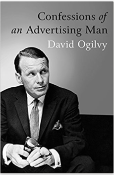
To prepare for the trip, I read our host’s two landmark books, Confessions of an Advertising Man and Ogilvy on Advertising. David Ogilvy (1911–1999) was an exuberant personality and a fabulous salesman, not only of his clients’ products but of the profession itself, and no less of his own self-made and self-curated myth. Even in 2004, five years after his death and more than three decades after his initial retirement from the agency he’d given his name, he finished first in an Adweek survey that asked what person, living or dead, had inspired the magazine’s readers to take up their profession.
As I discovered in person, Ogilvy was an amazing raconteur and knew himself to be one, which would have ruined the effect except that his talent was so prodigious that it implicated you, made you feel that the credit in some way redounded to you; it was as if, every time he told a story, he was newly rediscovering his gift, and you were the lucky soul who got to witness the discovery; or maybe you’d even caused it, by being such an unprecedentedly excellent audience. He had begun his working life, the man himself told us in the kitchen at Touffou, as a door-to-door stove salesman in Scotland. After emigrating to the US in 1938, Ogilvy took a job with George Gallup’s innovative new polling company, where he developed his life-long devotion to understanding one’s customer through data. Back in England, he spent World War II applying those same research techniques and skills to matters of military intelligence. In 1949, Ogilvy opened his agency in New York.
Among Ogilvy’s many contributions to the field over the next quarter-century was his virtual invention of the Fictional Personage as Brand Identity, most famously The Man in the Hathaway Shirt. That character’s hallmark was a rakish eyepatch, but the patch was never mentioned explicitly in the copy, so as to enhance its air of intrigue. It was the advertising equivalent of a McGuffin. Whence the underlying injury? War wound? Illness? Dueling society? Cufflink mishap? Pirate fetish? Or was it, as Spinal Tap’s manager cheerfully admits when the documentarian asks about the cricket bat he keeps brandishing and rapping in his palm, just a . . . what is the word? Affectation? Yes, right.
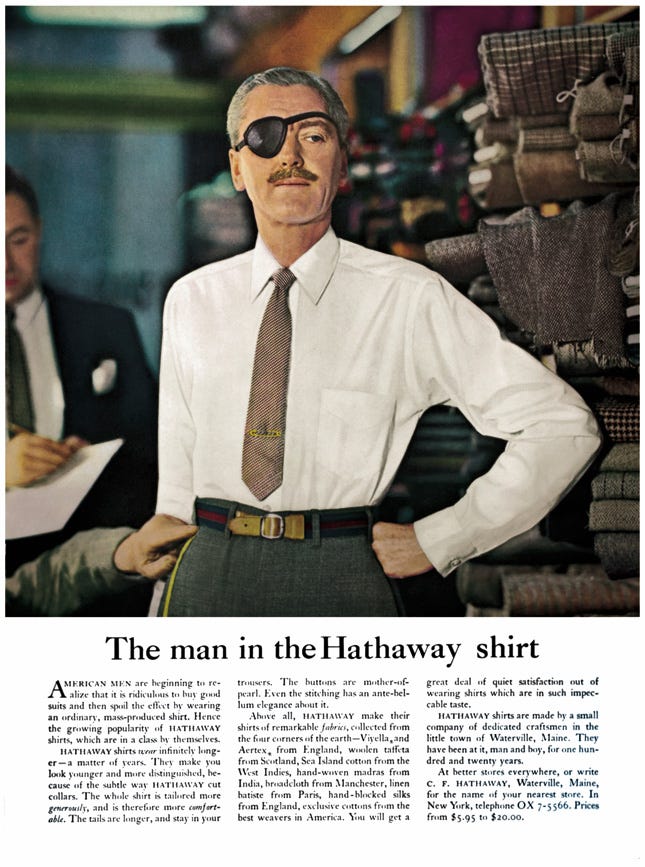
In today’s adscape, perhaps The Man in the Hathaway Shirt’s best-known lineal descendant is Dos Equis’s “Most Interesting Man in the World,” a character who seems born of a mashup of that campaign with another Ogilvy creation, this one also a precursor to those (by Chrysler, Coors, Martha Stewart Home, Papa John’s, Bush Beans, Jimmy Dean, and many others) that involve making a corporate executive into a brand’s spokesperson and image. In the 1950s, Ogilvy built his campaign for Schweppes tonic water around that company’s Commander Edward Whitehead, with his signature Van Dyke and adventurous twinkle, thus creating a more-or-less real-life character popularly known as Commander Schweppes, avatar of the brand’s fizzy “Schweppervescence.”
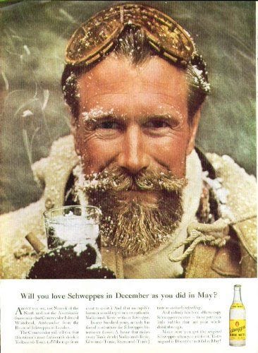
(Note to the art director who rhymed the golden-tinged beard with those bizarre golden goggles: Bravo!)
In 1973 Ogilvy and his wife, Herta, purchased Touffou, parts of which date to the twelfth century, and moved to France. His retirement wouldn’t quite take — David would emerge fifteen years later to head Ogilvy in India. Even in the interim, it was a retirement from the field but not the fray: Ogilvy’s correspondence was so voluminous, he told us, that the nearby village’s post office had to be reclassified and its postmaster awarded a bump in salary.
On our first bewildering night at the castle, we were led out across the old moat (not a landform met often in the Edisto Swamp of Orangeburg County) to a plein-air meal, complete with wait staff, on a parapet (at the far right in the picture below, which was taken years later). There I encountered for the first time both a food and a culinary concept: avocadoes (as exotic to me as yak steak or jackfruit would have been) and cold soup. The gourmet combination of these two novelties seemed, to a polite southerner with an obligation to eat a seemly amount of each dish, infinitely cruel. And so in a period of mere minutes that evening, I was introduced to at least six newnesses: moats, parapets, livery, avocado, cold soup, and (with every bite) my rising gorge.

The next morning, David and Herta graciously showed my girlfriend and me around, and he regaled us — here was the first person I ever encountered who earned and embodied that word, with its implication of a stiff wind encountered over and again — with more stories.
That night at dinner, as I recall, we were joined by another house guest. David Ogilvy was a force of nature, to be marveled at but not identified with — can one identify with a hurricane? Walter Landor was … something else. These days he might be called an image architect, but he was much more than that too.
Landor and his host were not only well-matched as ad-world titans and raconteurs, they were also near coevals (in their early seventies, with Ogilvy two years the elder), and both were Europeans who’d made their bones in America. Landor, originally Landauer, was born in Munich in 1913 and left (shortly before that verb would have had to be “fled”) in 1931, first for England and then for the US.
I have no idea what Walter Landor was like when he wasn’t sitting next to David Ogilvy; it seems likely, given what I’ve learned since, that he was himself a big and magnetic personality. This was a man who in the 1960s made his corporate headquarters a refurbished ferryboat, the Klamath,docked in San Francisco Bay, and who sometimes sported an admiral’s cap when he was aboard. But in this setting, at least by comparison, he seemed lower-key, softer-spoken.
Beyond a couple of basics about Walter Landor — his mischievous wit and his white mustache — my memory of him that night is spotty. But I remember with perfect vividness my shock when he revealed his vocation and produced his sample book. This was nothing like an episode of the old game show What’s My Line, in which a celebrity panel would conduct a yes-or-no interrogation in an effort to identify a guest’s strange job; there was no teasing reticence on Landor’s part, no attempt to hold us in suspense. In fact, everybody else at the table (including my significant other, who was the daughter of an Ogilvy exec, after all) presumably knew. So perhaps this was yet another in my string of Touffou-exposed Novelties That Shouldn’t Have Been . . . but Landor’s profession, once divulged, seemed as miraculous to me as if — What’s My Line-style — he’d revealed himself to be the operator of a skirt-blowing machine in Rockaway Park.

And in fact his job wasn’t exotic. Landor was a graphic designer by trade, a brand-builder by profession. In retrospect, what surprises me most may be my own yokelly obliviousness: Because I’d never given commerce so much as a thought, it had never occurred to me that logos — much less brand identities, a term that would have baffled me — were designed by anyone. I guess I imagined that they emerged fully formed, Athena-like, from the heads of their founders. Coca-Cola didn’t have a logo; it was a logo. And indeed, to hear Landor talk about it, that conflation of brand and trademark was by design. He’d created — and showed us in his book — the famous symbols for Del Monte, Cotton, Frito-Lay, Levi Strauss, Delta Airlines, Miller Lite, Marlboro, Bank of America, Alitalia, and many more.
But what impressed me most that night was the way Landor’s work — and his mien, and his tone — combined two things I’d always thought incompatible: ego and humility. The man took obvious pride in his work. He didn’t softpedal its importance, either, adopting as his credo “Products are made in the factory, but brands are created in the mind.”
Nor did he balk at acknowledging the role of artistic ego in design. As he put it in a 1985 art-school commencement speech, “Some of us strive for self-expression — just like fine artists. And some of us strive to communicate — and that’s a whole other fine art. I think we have matured as designers when we eventually realize that these need not be mutually exclusive goals.” Landor’s designs had what might be called the arrogance of art; they asserted the right to, as John Berryman put it, “not only express the matter in hand but add to the stock of available reality.” But the art then neatly and quickly effaced itself, became not just work in the service of something else but the something else.
A few years later, when I read Marjorie Sandor’s story about the self-abnegating virtuoso, it was Landor — Sandor’s cousin by rhyme, which probably helped — whom the accompanist would put me in mind of. Here was the artist simultaneously unmissable and unseen.
Until then I’d ignored or glibly dismissed business; it was lower than and inimical to art, was what you did when you gave up. My encounters with Ogilvy and Landor, and later with my LMPM colleagues, wrecked that fantasy. But it wasn’t only my sense of the inferiority of commerce that had to go; the notion of art’s superiority, too — an idea that had always made me queasy — could be jettisoned, too. As someone who aspired, vaguely and privately and embarrassedly, to do something that might someday be called art (not by me, Lord knows, but I hoped maybe someday by someone), I felt as if Landor had found an ingenious way to simultaneously indulge in and mitigate the appalling ego of it. He’d devised a way to produce something that was art only at its conception, until acceptance by the client . . . at which point it became the symbol and avatar of something else, something that antedated the art but that it would have a role in shaping.
Walter Landor — and this is why, much as I marveled at David Ogilvy, it was his houseguest I subsequently fixed on — had found a way to inscribe his egomania in invisible ink.
*
Which, this time I promise, brings us back to the walldogs of Cincinnati … to one in particular. He had the knack but not the fame of Ogilvy and Landor. He was a workman.
Until World War II, say, it would have been almost inconceivable for a sign painter to affix a signature to his work. Even afterward, the practice would have been rare, I think — and I’ve never noticed such signatures elsewhere (though I’m confident that examples exist). To name oneself would be to claim the status of art for these ads, and that would both violate the code and, potentially, annoy the client.
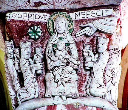
There’s an interesting parallel with medieval art here. Artists of that time almost never designed their work, as they considered themselves conduits through which God created he artwork. The first known signed work is the capital of a church column in the village of Chauvigny, France — as it happens, just eight miles from Ogilvy’s chateau — that says “Gofridus mefecit”: “Godfried made me.”
Postwar, especially in a hollowed and hollowing Rust Belt city like Cincinnati, the calculus changed. The population was fleeing to the suburbs or the Sunbelt; other media and other modes of advertising were emerging, flourishing, and asserting their supremacy; the hazards of lead paint — the material that had made such signs durable — were becoming apparent. And, too, the age of the ghost sign was beginning. That phenomenon has from its beginning been entangled with nostalgia, and it’s not hard to imagine sign-painters being especially susceptible to this as they saw previous generations of signs outlast their creators, the businesses they’d once touted, in many cases the viability of the neighborhoods they’d adorned. Some signs were lost to the bulldozers of urban renewal, or simply to wear and to sun-bleaching. Others were painted over, blocked out, or enshrouded in graffiti (whose great underpinning has always been “Hey, I’m HERE”), and the conflation of ghost signs with wall-tagging led some city leaders to equate them, and to decry ghost signs as just a slightly quainter form of blight.
So I imagine that painters heard the moans and clanking chains of ghost signs well before the rest of us, and were probably more attuned, too, to the message they sent that not only the city they had represented but the vocation they had made possible were imperiled. Those painters would also have discerned, again far ahead of the rest of us, what kinds of legacy tended to remain. Many of the signs around town by the 1960s were for long-gone businesses, brands, and establishments. Whole neighborhoods had been left behind or plowed under; the city’s population had slowed, then stopped, and now the hemorrhage had begun.
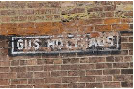
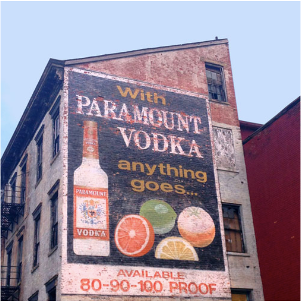
For the first dozen years I lived in Cincinnati, I enjoyed and mentally catalogued the ghost signs I passed — little glimpses of an older city beneath the palimpsest of the present — and thought I was paying close attention. But three or so years ago, as I passed an old Paramount Vodka sign on Elm Street in the rapidly (and for reasons of gentrification and displacement, somewhat controversially) resurgent Over-the-Rhine neighborhood, I noticed at the bottom left a little nameplate in black and white, just two bricks high and five or six wide: GUS HOLTHAUS. (In a way, I should say, gentrification — much as I might like to deplore it — had made the discovery possible; this was a neighborhood I’d often passed through while driving, but I could only have noticed the signature on foot, at old-city pace rather than with the dial turned to Las Vegas.) Holthaus’s signature, visible at this range only as a blur, begins beneath the gap between the 8 and 0.
My experience with ghost signs, as with certain graffiti tags, has been that after a long stretch of dim, barely conscious awareness, my notice of them at some point — in my case spurred by a writer friend who photographs vanishing traces of paint — turns self-aware . . . and once that happens I am shocked to discover that these signs, once they swim up into vision, turn out to be everywhere. That experience was replicated when I saw that first signature. As I walked the city now I noticed ads signed by friends or rivals of Gus Holthaus . . . and several more featuring his name.
From the first time I saw it, the practice of attaching a signature — begun who knows how, and under circumstances I can’t guess — struck me as having a rueful, valedictory tone. This wasn’t self-assertion of the brash or braggadocious type, not at all; it seemed to announce on the way out, more in sorrow than in anger, that “This is art, and we were here, and likewise the generations of painters before us.” That’s not to say that these signatures didn’t assert the artisan’s pride, or even that they weren’t — in a small-scale, at-the-margins way — a bid for a piece of immortality: a bet that these signs might last, and that in lasting they might, eventually, gain the charm and prestige that longevity can confer. But to me those signatures read as small gestures of farewell, illegible except to those who slowed their approach and trained their eyes, from a profession on the way out.
I suspect they read in a similar way to graffiti artists, too. There lies the kinship between graffitists and pros like Gus Holthaus, who might otherwise be thought of us rivals or enemies: His signatures, like their tags, are an acknowledgment of evanescence — this both their point and their essential irony — that hopes to stay. As I hinted earlier: I’ve noticed that though graffiti artists are attracted to the abandoned buildings and big canvases that ghost signs provide, they tend to spray their tags not across the old images but next to them. I want to think that’s a kind of professional courtesy, respect for the guild they both belong to.
I noted the signatures and moved on, and for two years I thought no more of Gus Holthaus.
*
But one morning last year, as I pondered what part of the cemetery to explore on my walk, I noticed — it was early November, and the foliage had begun to thin — the stained glass along the back of a hulking building near the front gate.
I generally avoid Spring Grove’s street-facing southeastern corner, where the offices are, so as to avoid pestering the bereaved or getting in the way of employees. I’d known a building was nestled in those trees, but I thought it was one of several funeral chapels on the grounds. Now I saw that it was far too large for that . . . and sure enough, my map designated it as “MM” — Memorial Mausoleum. Spring Grove has several partly covered mausoleums, gardens, groves, and fountains, but until then I’d never known about this fully indoor, climate-controlled section. I asked a groundskeeper passing on his golf cart whether it was OK to explore it, and he let me in with his key.
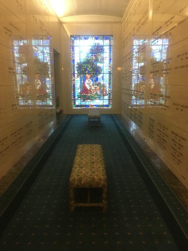
Near the entrance was a little room that looked like an alumni-club lounge, filled with etageres, the shelves lined with cremains-holding art pottery (often Rookwood, this being Cincinnati), a discreet plaque in front of each. At the end of the long hall to the left I found a bay-windowed solarium, complete with plashing water feature, and off to one side what looked like a bank of lockers in an executive gym. But most of the building consisted of little side halls off the main one, each with upholstered benches and a stained glass window at one end.
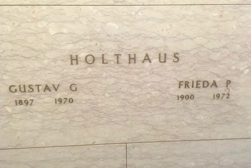
On the reflective marble walls of one of these, a name jumped out at me: Gustav Holthaus. How did I know that name? Wait . . . was it? It had to be — yes, the great Cincinnati walldog, now out of the elements once and for all.
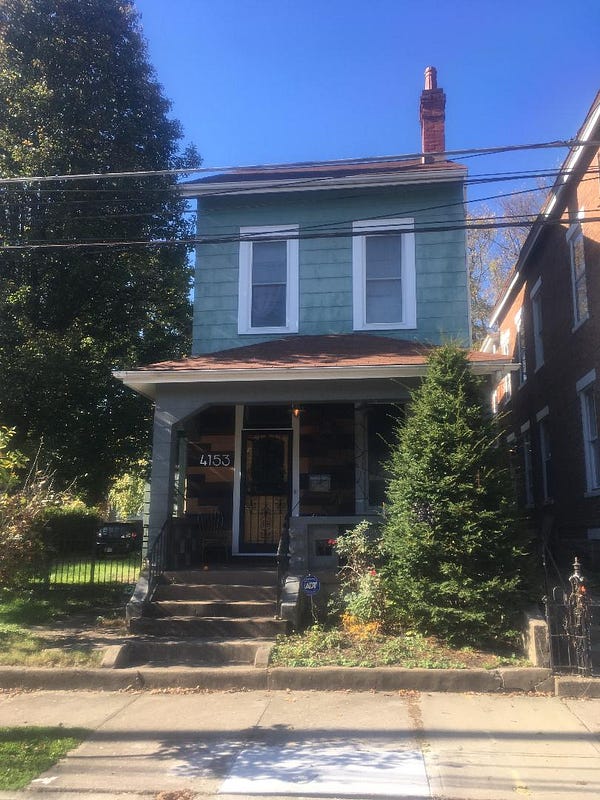
Holthaus died in 1970, at seventy-two. An internet search revealed that there was of course no public hoopla — just a modest funeral notice produced by the family. By reading the death certificate, I learned that Holthaus had lived (and died) just a few blocks from my house, on a modest two-block-long side street that now overlooks a school playground.
My interest was reignited, so I began digging. It turns out that there’s a thriving subculture of ghost sign fans in Cincinnati.
From Ronny Salerno’s book, Fading Ads of Cincinnati (and from Bill Rinehart’s onetime blog “The Writing on the Walls,” to which Salerno’s book introduced me), I learned that Holthaus’s company has continued — as Holthaus Lackner — and that when the company won the rights to create the signage at the Reds’ new Great American Ball Park in 2003, they smuggled in a hand-painted tribute to Gus Holthaus and his forebears: a flying pig, Cincinnati’s symbol, daubed onto the brick exterior of a “vintage” tavern called Bootleggers.
*
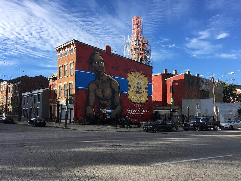
The story doesn’t end there, quite. In 2005, Tod Swormstedt founded the American Sign Museum, and he has invited contemporary walldogs here to show off their skills. Meanwhile, as part of its renaissance, the city — mainly through the labor of Artworks Cincinnati — has commissioned and executed over a hundred large-scale murals (with almost every one of the city’s fifty-two named neighborhoods included).
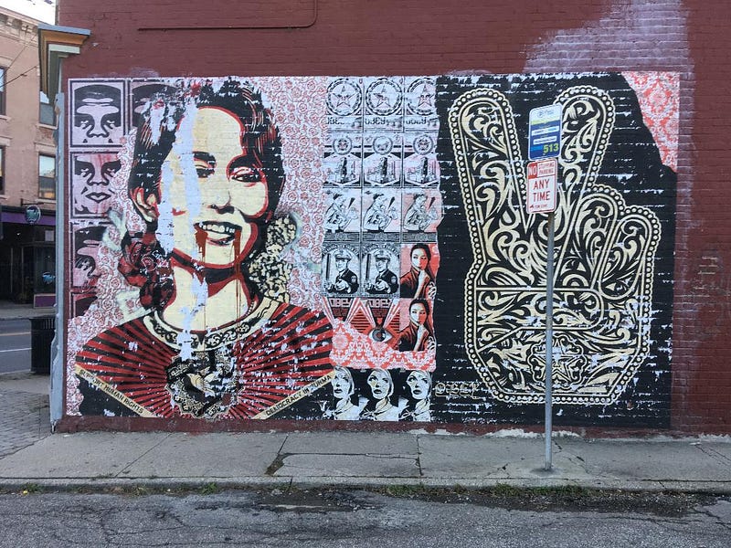
The best-known mural in my neighborhood, located just a few hundred yards from the Holthaus residence, is a likeness of Nobel Peace laureate Aung San Suu Kyi by Shepard Fairey. In 2010, Fairey and his crew — which included Spencer Elden, who was the swimming baby featured on the cover of Nirvana’s Nevermind back in 1991 — placed sixteen murals around town. These are not painted, but produced in strips at his studio, then aligned and assembled on site and affixed to the wall using a method that harks back all the way to the nineteenth century: with wheat paste.
All this is to suggest that Gus Holthaus’s legacy extends far past his nameplate on those few remaining walls around town. I’d contend that his unconventional decision toward the end of his career to sign some bigger works, discreetly but visibly, contributed in a small but crucial way to the appreciation and preservation of ghost signs as art in this city, and thus to the explosion of murals and public art around town — a development that culminated in the Blink Festival of 2017, which drew a million people downtown over four nights to see those works. Indirectly, at least, his determination to ignore or elide the old distinctions between commercial work and art prefigured the founding, and the thriving, of the American Sign Museum. Gus Holthaus lives on not only in the sly tribute at the ballpark but also in all of his namesake firm’s design work, and perhaps even in that of Landor, Inc. — which opened a Cincinnati office in the 1990s.
I’m reminded of that kitsch classic of short fiction, O. Henry’s maudlin, wonderful “The Last Leaf.” In that story, as fall staggers toward its end, a desperately ill girl is fading in tandem with the patch of ivy visible from her window. One by one, the leaves on the brick wall opposite flame out, parch, shrivel, and drop, until only one remains. But it, improbably, hangs on all winter long, providing the example the sick girl needs. Gradually her deathbed sheds that cruel prefix, the girl recovers, and come spring she goes outside . . . to discover that the last leaf was painted on by her friend, the elderly artist next door. He has saved her with his walldog masterpiece. (In the story, the artist has since died — O. Henry was not noted for artistic restraint — from a pneumonia contracted by being outside in the cold and wet.)
Which is to say, in a pithy O. Henry-style message, that there are many ways to chase immortality, which is after all a lasting advertisement for the self. It is capricious, a shape-shifter — and there’s no guessing what our legacies will be, if we are lucky enough to have them. We might leave behind Slaughterhouse-5 or She Skips to Her Loo; might survive in memory on the basis of House of Cards or sexual misconduct, perhaps the video to Jermaine Stewart’s “We Don’t Have to Take Our Clothes Off.” Maybe we’ll design the Barack Obama Hope poster, or possess the most famous underwater infant penis of the grunge movement.
The Man in the Hathaway Shirt; the Levi’s batwing logo; a fading ad for a cheap well vodka. Who knows what will outlast us? All we can do is our work, and hope the memorials we leave inspire someone.
Gus Holthaus left tombstones all over town, and he made them himself, save the last.
***************************************************************************************

Michael Griffith’s books of fiction are Spikes (Arcade, 2001), Bibliophilia (Arcade, 2003), and Trophy (TriQuarterly Books/Northwestern University Press, 2011), which was named one of Kirkus Reviews’ Best Books for that year. “Ghosts of the Walldogs” is part of a forthcoming nonfiction collection, Windfalls in the Bone Orchard.
His work has also appeared in The Washington Post, Southern Review, Ninth Letter, Virginia Quarterly Review, New England Review, Oxford American, Shenandoah, and many other periodicals. He is the recipient of fellowships from the Charles Phelps Taft Research Center, the National Endowment for the Arts, and others. He is founding editor (since 2005) of the Yellow Shoe Fiction series for Louisiana State University Press and fiction editor of Cincinnati Review.
******************
Access the entire issue by clicking on the cover above or on this title: “Rivals & Players.”